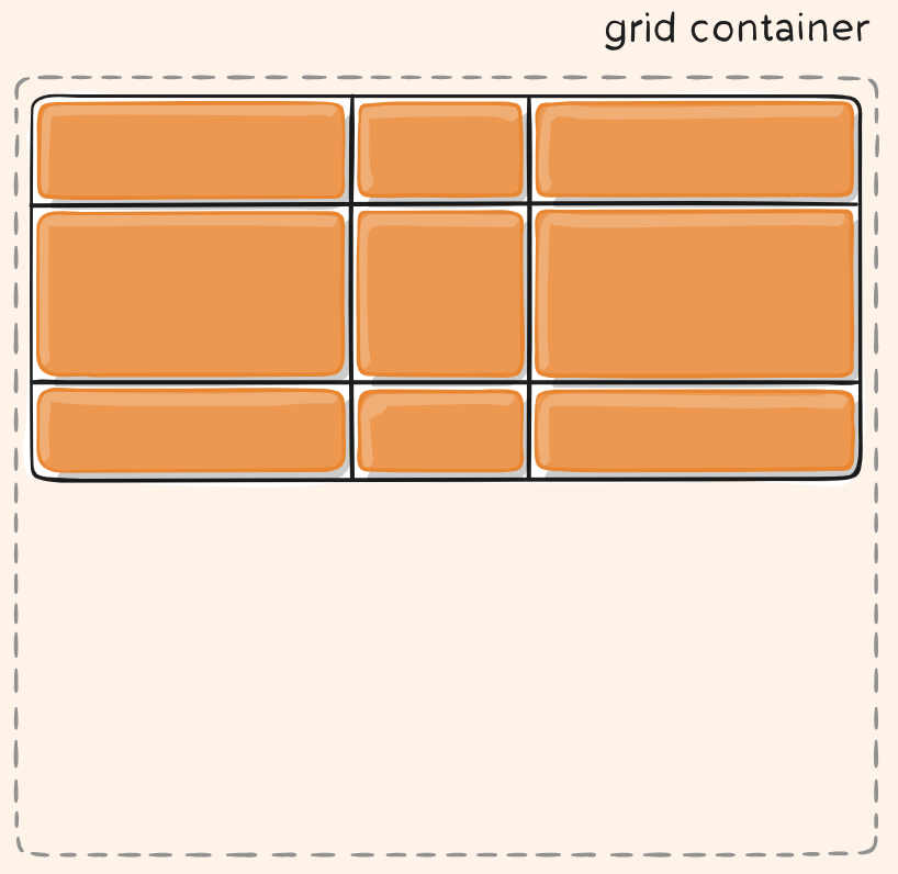
Overview
- CSS grid layout is a popular, two-dimensional layout system for the web.
- It lets you organize content into rows and columns and offers many features to simplify the creation of complex layouts.
- Grid are using Similar concepts with Flexbox. They has concepts of parent container and the child elements, etc.
- CSS Grid has been supported by all major browsers since 2017.
- Modern CSS frameworks, such as Tailwind CSS, have incorporated CSS Grid utilities.
- Good for Responsive Design.
Grid Terminology
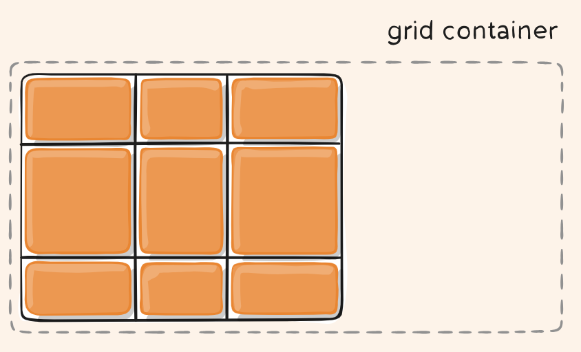
- Grid Container: It’s the direct parent of all the grid items.
- Grid Item: The children (i.e. direct descendants) of the grid container.
- Grid Lines are the lines that make up the grid. These can be horizontal or vertical. We can refer to them by number, or by name.
- Grid Track: The space between two adjacent grid lines. You can think of them as the columns or rows of the grid.
- A Grid Cell is the space between 4 Grid Lines. So it is the smallest unit on our grid that is available for us to place an item into. Conceptually it is just like a table cell.
- A Grid Area is any area on the Grid bound by four grid lines. It may contain a number of Grid Cells.
What do grid-template mean
CSS Grid define grid-template-columns, grid-template-rows properties for container. These two properties define the columns and rows of the grid with a space-separated list of values. These values represent the track size, and the space between them represents the grid line.
So, grid-template refer to the template values which will apply to all items, cells.
Basic Usage
Just like Flex, CSS Grid define some properties for containers, some properties for items.
- Define Grid Container. A common way to use Grid is using
grid-template-columns,grid-template-rowsto define layout - Create Items inside Container. A common way to Use
grid-columngrid-rowin Items.
using grid-template-columns grid-template-rows
.container {
  grid-template-columns: ...  ...;
  /* e.g.
      1fr 1fr
      minmax(10px, 1fr) 3fr
      repeat(5, 1fr)
      50px auto 100px 1fr
  */
  grid-template-rows: ... ...;
  /* e.g.
      min-content 1fr min-content
      100px 1fr max-content
  */
}
Example:
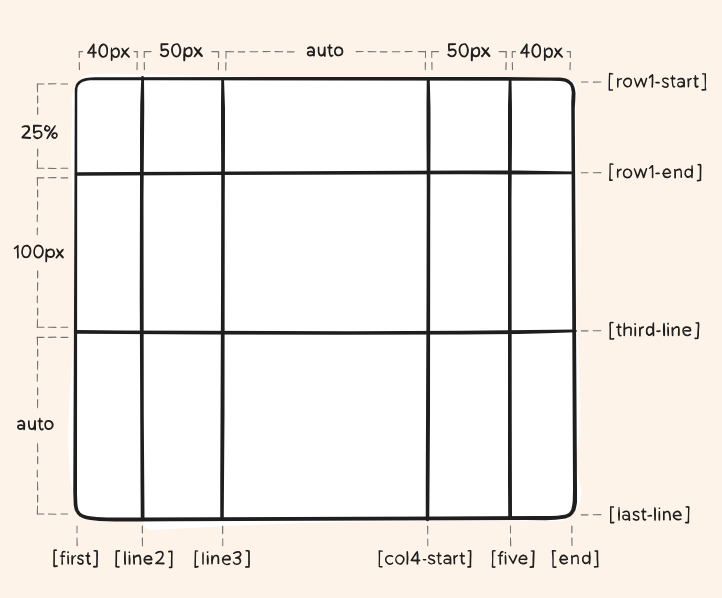
You can choose to explicitly name the lines. (Note, the bracket syntax for the line names):
.container {
  grid-template-columns: [first] 40px [line2] 50px [line3] auto [col4-start] 50px [five] 40px [end];
  grid-template-rows: [row1-start] 25% [row1-end] 100px [third-line] auto [last-line];
}
Use grid-column grid-row in Items
Layouting Items is Line-based placement. You can specify the start and end lines of the grid area where an item should be placed.
Example:
.item-c {
  grid-column: 3 / span 2;
  grid-row: third-line / 4;
}
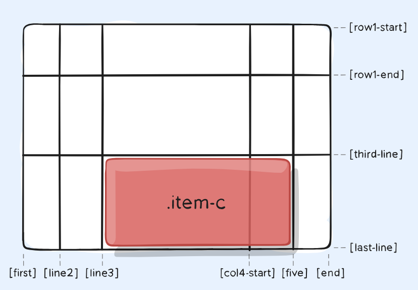
The Values can Be:
-
<line>– can be a number to refer to a numbered grid line, or a name to refer to a named grid line -
span <number>– the item will span across the provided number of grid tracks -
span <name>– the item will span across until it hits the next line with the provided name -
auto– indicates auto-placement, an automatic span, or a default span of one
grid-template-areas
Other than Line-based placement, an alternative way to arrange items on your grid is to use the grid-template-areas property and give the various elements of your design a name.
Example of Positioning with grid-template-areas:
.container {
  display: grid;
  grid-template-areas:
    "header header"
    "sidebar content"
    "footer footer";
  grid-template-columns: 1fr 3fr;
  gap: 20px;
}
header {
  grid-area: header;}
article {
  grid-area: content;}
aside {
  grid-area: sidebar;}
footer {
  grid-area: footer;}
The rules for grid-template-areas are as follows:
- You need to have every cell of the grid filled.
- To span across two cells, repeat the name.
- To leave a cell empty, use a . (period).
- Areas must be rectangular — for example, you can’t have an L-shaped area.
- Areas can’t be repeated in different locations.
Container properties
gap
Specifies the size of the grid lines. You can think of it like setting the width of the gutters between the columns/rows.
.container {
  grid-template-columns: 100px 50px 100px;
  grid-template-rows: 80px auto 80px;
  gap: 15px 10px;
}
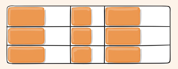
justify-items
Aligns grid items along the inline (row) axis (as opposed to align-items which aligns along the block (column) axis). This value applies to all grid items inside the container.
.container {
  justify-items: start;
}
align-items
Aligns grid items along the block (column) axis (as opposed to justify-items which aligns along the inline (row) axis).
.container {
  align-items: start;
}
justify-content
Sometimes the total size of your grid might be less than the size of its grid container. In this case you can set the alignment of the whole grid within the grid container. This property aligns the grid along the inline (row) axis (as opposed to align-content which aligns the grid along the block (column) axis).
.container {
  justify-content: start;
}
.container {
  justify-content: space-around;
}

align-content
The total size of your grid might be less than the size of its grid container. This property aligns the grid along the block (column) axis (as opposed to justify-content which aligns the grid along the inline (row) axis).
.container {
  align-content: start;
}
Items properties
grid-column grid-row
grid-column = grid-column-start / grid-column-end
grid-row = grid-row-start / grid-row-end
Determines a grid item’s location within the grid by referring to specific grid lines.
grid-area
Gives an item a name so that it can be referenced by a template created with the grid-template-areas property.
justify-self
Aligns a grid item inside a cell along the inline (row) axis (as opposed to align-self which aligns along the block (column) axis). This value applies to a grid item inside a single cell.
align-self
Aligns a grid item inside a cell along the block (column) axis (as opposed to justify-self which aligns along the inline (row) axis). This value applies to the content inside a single grid item.
fr unit
The fr unit make lot of layouts much easier. fr represents one fraction of the available space in the grid container to flexibly size grid rows and columns.
The fr unit distributes space proportionally. You can specify different positive values for your tracks. Creating three tracks below:
.container {
  display: grid;
  grid-template-columns: 2fr 1fr 1fr;
}
The fr unit can be used with other CSS length such as %, px or em.
Useful Functions
-
minmax()function lets us set a minimum and maximum size for a track. -
fit-content()function uses the space available, but never less than min-content and never more than max-content. -
min()function. -
max()function. - The
repeat()function can save some typing. It can get extra fancy when combined with keywords:-
auto-fill: Fit as many possible columns as possible on a row, even if they are empty. -
auto-fit: Fit whatever columns there are into the space. Prefer expanding columns to fill space rather than empty columns.
-
FAQ
Flexbox vs. Grid Layout
- Flexbox is like stacking or lining up items in a row/column one at a time.
- Grid is like laying out items on graph paper — you plan the whole structure first.
- Usually, they will be used together. Grid for the overall layout and Flexbox inside components.
Implicit and explicit grids
- Explicit grid is created using
grid-template-columns orgrid-template-rows. - Implicit grid extends the defined explicit grid when content is placed outside of that grid, such as into the rows by drawing additional grid lines.
By default, tracks created in the implicit grid are auto sized, which in general means that they’re large enough to contain their content. If you wish to give implicit grid tracks a size, you can use the grid-auto-rows and grid-auto-columns properties.
.container {
  display: grid;
  grid-template-columns: 100px 100px auto;
}
auto keyword
auto keyword is a lot like fr units, except that they “lose” the fight in sizing against fr units when allocating the remaining space.
Support RWD
Fluid columns snippet
Fluid width columns that break into more or less columns as space is available, with no media queries!
.grid {
  display: grid;
  grid-template-columns: repeat(auto-fill, minmax(200px, 1fr));
  /* This is better for small screens, once min() is better supported */
  /* grid-template-columns: repeat(auto-fill, minmax(min(200px, 100%), 1fr)); */
  gap: 1rem;
}
Subgrid
It’s possible to nest a grid within another grid, creating a “subgrid”. You can do this by setting the display: grid property on a grid item.