What is Jetpack Compose
XML has been a staple in Android development since the early days. Jetpack Compose represents a paradigm shift in Android UI development. The first preview of Jetpack Compose was announced in May 2019, and the framework was made ready for production in July 2021.
- Jetpack Compose is Android’s recommended modern toolkit for building native UI.
- You can think Jetpack Compose do the same job as React.js. It is declarative, update View according states, etc.
- You won’t be editing any XML layouts or using the Layout Editor.
- You will call composable functions to define what elements you want, and the Compose compiler will do the rest.
- In Jetpack compose you write declarative code that describes how data should be displayed as UI.
Composable functions
Jetpack Compose is built around composable functions. These functions let you define your app’s UI programmatically by describing how it should look and providing data dependencies, rather than focusing on the process of the UI’s construction (initializing an element, attaching it to a parent, etc.).
To create a composable function, just add the @Composable annotation to the function name. The annotation tells the Kotlin compiler that this function is used by Jetpack Compose to convert data into UI.
Composable functions are the building blocks of UI in Compose. This encouraging you to break your UI into a library of reusable elements.
Hello World example
Create a new project: In The MainActivity.kt file
- Notice there are some automatically generated functions in this code, specifically the
onCreate()and thesetContent()functions. - The
onCreate()function is the entry point to this Android app and calls other functions to build the user interface. - The
setContent()function within theonCreate()function is used to define your layout through composable functions. All functions marked with the@Composableannotation can be called from thesetContent()function or from other Composable functions.
class MainActivity : ComponentActivity() {
    override fun onCreate(savedInstanceState: Bundle?) {
        super.onCreate(savedInstanceState)
        setContent {
            MessageCard("Android")
        }
    }
}
@Composable
fun MessageCard(name: String) {
    Text(text = "Hello $name!")
}
Basic staff
-
mutableStateOf(value)creates aMutableState, which is an observable type in Compose. Any changes to its value will schedule recomposition of any composable functions that read that value. -
rememberstores objects in the composition, and forgets the object when the composable that calledrememberis removed from the composition. -
rememberSaveableretains the state across configuration changes by saving it in a Bundle.
Recomposition
In an imperative UI model, to change a widget, you call a setter on the widget to change its internal state. In Compose, you call the composable function again with new data. Doing so causes the function to be recomposed–the widgets emitted by the function are redrawn, if necessary, with new data. The Compose framework can intelligently recompose only the components that changed.
Composable functions Just like React components
- Composable functions can execute in any order
- Composable functions can run in parallel
- Recomposition skips as much as possible
- Recomposition is optimistic
- Composable functions might run quite frequently
Layout
Constraints and Modifiers are keys to understand Compose Layout.
Three Phases in Compose
There are three phases in the process of transforming data into UI:
- composition(What to Show): transforme composable functions into a UI tree.
- layout(Where to Show): use this UI tree as input, the collection of layout nodes contain all the information needed to eventually decide on each node’s size and location in 2D space. during the layout phase the tree is reversed using the following three-step algorithm:
- first a node measures its children if any and
- then based on those measurements it decides on its own size and,
- finally it places its children relative to its own position. At the end of the phase each layout note will have an assigned width and height and an x y coordinate of where it should be drawn. each node only visited once.
- drawing(How to Show): now we know the sizes and XY coordinates of all of our layout nodes. the tree is traversed again from top to bottom and each node draws itself on the screen.
We are focus on Layout here.
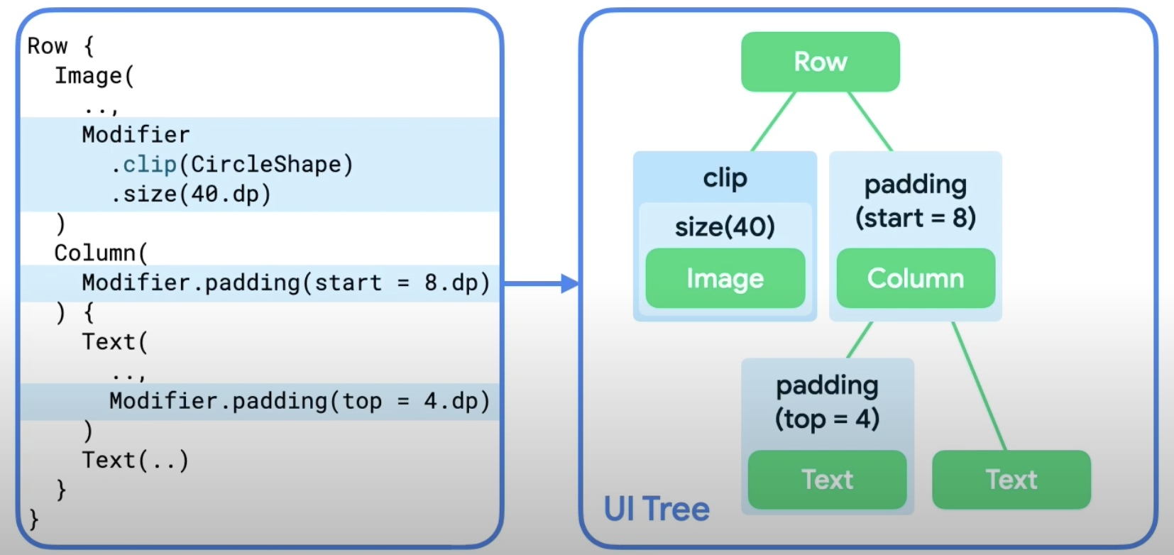
How to use Modifier
We can chain multiple modifiers, like Modifier.clip(CircleShape).size(40.dp),. Each modifier node wraps the rest of the chain and the layout node Within. For example when we chain a clip in a size modifier, the clip modifier node wraps the size modifier node which then wraps the image layout node in the layout phase:
Understand Constraints
Modifier will decide the positin, size, etc for the node. And Jetpack compose use ‘Constraints’ which come from parent’s node to layout nodes. that means Modifier and Constraint will work together to layout nodes. The Constraint can affect the size of composables, and Modifier(depend on which modifier) affect the Constraints.
How Constraint affect Modifier?
- For example, the passing in constraint is
w:0-300; h:0-400, modifier issize(50), then the modifier pass constraintw:50; h:50to next node. - The passing in constraint is
w:0-300; h:0-400, modifier issize(500), then the modifier will adapt to constriant to bew:300; h:400. - If the passing in constraint is
w:50-300; h:50-400, modifier issize(40), modifier will adapt to constriant to bew:50; h:50. - If you don’t want node adhere to passing in constraint, you can use
requiredSize(). -
fillMaxSize()will pass constraintw:300; h:400in. -
wrapContentSize()will reset the minium constraint. And also can put it’s child to the center.
How Modifier adapt constraint?
After the node get size, location etc, then it will pass the size, etc. back up the tree. The parent will decide the final size and location. Following is a good way to understand the interaction between modifier and contraint:
Image(
    painterResource(R.drawable.hero),
    contentDescription = null,
    Modifier
        .clip(CircleShape)
        .padding(10.dp)
        .size(100.dp)
)
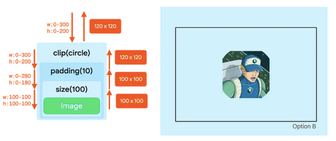
Here is the process:
- The clip modifier does not change the constraints.
- The padding modifier lowers the maximum constraints.
- The size modifier sets all constraints to 100dp.
- The Image adheres to those constraints and reports a size of 100 by 100dp.
- The padding modifier adds 10dp on all sizes, so it increases the reported width and height by 20dp.
- Now in the drawing phase, the clip modifier acts on a canvas of 120 by 120dp. So, it creates a circle mask of that size.
- The padding modifier then insets its content by 10dp on all sizes, so it lowers the canvas size to 100 by 100dp.
- The Image is drawn in that canvas. The image is clipped based on the original circle of 120dp, so the output is a non-round result.
Material Design
Compose is built to support Material Design principles. Many of its UI elements implement Material Design out of the box.
How to use
Jetpack Compose provides an implementation of Material Design 3 and its UI elements out of the box.
Note: the Empty Compose Activity template generates a default theme for your project that allows you to customize MaterialTheme.
For example, improving the appearance of MessageCard composable using Material Design styling.
- To start, wrap the
MessageCardfunction with the Material theme created in your project,YourProjectTheme, as well as aSurface. - Material Design is built around three pillars: Color, Typography, and Shape. You will add them one by one.
- Color: Use MaterialTheme.colorScheme to style with colors from the wrapped theme.
- Typography: Material Typography styles are available in the MaterialTheme, just add them to the Text composables.
FAQ
- Why not use HTML, CSS and JavaScript for UI?