Responsive Web Design (RWD) is about using HTML and CSS to automatically resize, hide, shrink, or enlarge, a website, to make it look good on all devices (desktops, tablets, and phones).
Media queries can help with RWD, but are not a requirement. Flexible grids, relative units, and minimum and maximum unit values can be used without queries.
A modern-day solution for developing highly responsive layouts using traditional CSS is by combining Flexbox and Grid System.
Setting The Viewport
<meta name="viewport" content="width=device-width, initial-scale=1.0">
This viewport meta tag tells mobile browsers that they should set the width of the viewport to the device width, and scale the document to 100% of its intended size, which shows the document at the mobile-optimized size that you intended.
Why is this needed? Because mobile browsers tend to lie about their viewport width.
This meta tag exists because when smartphones first arrived, most sites were not mobile optimized. The mobile browser would, therefore, set the viewport width to 980 pixels, render the page at that width, and show the result as a zoomed-out version of the desktop layout.
Responsive Images
Using the width Property
If the CSS width property is set to 100%, the image will be responsive and scale up and down: <img src="img_girl.jpg" style="width:100%;">
Using the max-width Property
If the max-width property is set to 100%, the image will scale down if it has to, but never scale up to be larger than its original size: <img src="img_girl.jpg" style="max-width:100%;height:auto;">
Show Different Images Depending on Browser Width
The HTML
<picture>
  <source srcset="img_smallflower.jpg" media="(max-width: 600px)">
  <source srcset="img_flowers.jpg" media="(max-width: 1500px)">
  <source srcset="flowers.jpg">
  <img src="img_smallflower.jpg" alt="Flowers">
</picture>
Responsive Text Size
The text size can be set with a “vw” unit, which means the “viewport width”. That way the text size will follow the size of the browser window. <h1 style="font-size:10vw">Hello World</h1>
Media Queries
With media queries you can define completely different styles for different browser sizes.
- Media query uses the
@mediarule to include a block of CSS properties only if a certain condition is true. - Media queries are a popular technique for delivering a tailored style sheet (responsive web design) to desktops, laptops, tablets, and mobile phones.
- Media query is a CSS technique introduced in CSS3.
Media queries can be used to check many things, such as:
- width and height of the viewport
- width and height of the device
- orientation (is the tablet/phone in landscape or portrait mode?)
- resolution
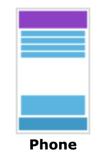
Example 1
Web page looks like this on Desktop:
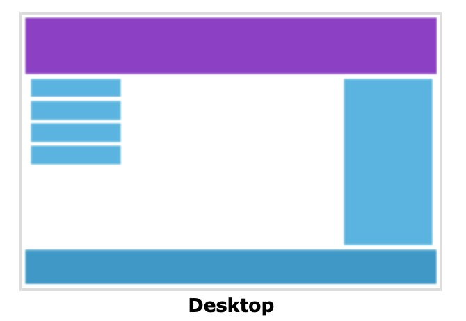
We can add a breakpoint where certain parts of the design will behave differently on each side of the breakpoint. Now we Use a media query to add a breakpoint at 768px:
@media only screen and (max-width: 768px) {
  /* For mobile phones: */
  [class*="col-"] {
    width: 100%;
  }
}
Example 2
@media screen and (max-width: 550px) {
  .card {
    flex-direction: column;
  }
}
Then browser can change .card class content as above when screen width less than 550px.
Container queries
(https://blog.logrocket.com/css-container-queries-guide)
-
CSS container queries allow us to style an element with regard to its parent or container size (width and height).
-
Container queries differ from media queries in the sense that media queries target the viewport (width and height) of the web browser in order to apply the style to an element.
-
CSS container queries enables designers to create webpages that are very responsive by ensuring that styles are applied to components based on their width and height and not based on the viewport of the full page.
-
The effect of Container query is very similar to Media query.
How to use container queries
- Similar to Media query. But a little bit complicated.
- card class should be inside card-container class.
- It need container-type
- container-name is optional
- Looks like this:
.card-container { container-type: inline-size; container-name: cardContainer; } .card { display: flex; flex-direction: row; } @container (max-width: 500px) { .card { flex-direction: column; } } - When the width of The container witch with cardContainer class is less than 500px, when card class will change accordingly.
RWD and React
matchMedia() API
Window matchMedia() API returns a MediaQueryList object with the results from the query.
Example: This example runs the media query (max-width: 600px) and displays the value of the resulting MediaQueryList’s matches property in a <span>; as a result, the output will say “true” if the viewport is less than or equal to 600 pixels wide, and will say “false” if the window is wider than that.
<span class="mq-value"></span>
let mql = window.matchMedia("(max-width: 600px)");

document.querySelector(".mq-value").innerText = mql.matches;
Write a MatchMediaWrapper Component
You can create this MatchMediaWrapper component to display differnent according to max-width.
const MatchMediaWrapper = ({mobileContent, desktopContent}) => {
  const [isNarrowScreen, setIsNarrowScreen] = useState(false)
  useEffect(() => {
    const mediaWatcher = window.matchMedia("(max-width: 500px)")
    setIsNarrowScreen(mediaWatcher.matches);

    function updateIsNarrowScreen(e) {
      setIsNarrowScreen(e.matches);
    }
    if(mediaWatcher.addEventListener) {
      mediaWatcher.addEventListener('change', updateIsNarrowScreen)
      return function cleanup() {
        mediaWatcher.removeEventListener('change', updateIsNarrowScreen)
      }
    } else {
      mediaWatcher.addListener(updateIsNarrowScreen)
      return function cleanup() {
        mediaWatcher.removeListener(updateIsNarrowScreen)
      }
    }
  },[])
  return isNarrowScreen ? mobileContent : desktopContent;
}
Use this Wrapper compoent:
const MyReponsiveComponent = () => {
  const mobileContent = (<div>This is what you see on mobile!</div>);
  const desktopContent = (<div>This is what you see on desktop!</div>);

  return <MatchMediaWrapper mobileContent={mobileContent} desktopContent={desktopContent}/>
}