Standard Deviation
Standard deviation measures how spread out the values in a dataset are from the mean (average).
Example:
Let’s say you have test scores from two classes:
Class A: [78, 80, 82, 81, 79] → Avg = 80 Standard deviation is low: everyone scored close to the mean.
Class B: [50, 60, 80, 95, 100] → Avg = 77 Standard deviation is high: big spread from the mean.
Formula (simplified):
For a dataset with values x1, x2,…,xn:
\[\sigma = \sqrt{\frac{1}{n} \sum_{i=1}^{n} (x_i - \bar{x})^2}\]- \(\bar{x}\) is the mean.
- \(x_i\) are the data values.
- The expression inside the square root is called the variance
Data Distribution
Understanding data distribution is key in statistics, data analysis, and machine learning. Data distribution describes how values in a dataset are spread out or arranged. It tells you:
- Which values occur most often
- How the values are grouped
- Whether the data is symmetrical, skewed, or has outliers
Example:
Imagine test scores from a class:
[70, 72, 75, 75, 76, 78, 80, 85, 90, 100]
You can see most scores are around 75–85, with one outlier (100). That pattern of how often each score occurs is its distribution.
Random module Example:
Use Random to analog Data Distribution, it is a list of all possible values, which shows how often each value occurs.
from numpy import random

x = random.choice([3, 5, 7, 9], p=[0.1, 0.3, 0.6, 0.0], size=(100))
print(x)
p is the Data Distribution. The sum of all probability numbers should be 1. Here the 9 never show up because of probability is 0.
Data Distribution Concepts:
- Frequency: How often each value appears
- Mean (average): Where the center of the data is
- Spread: How far the values are from each other
- Shape: Overall pattern (normal, skewed, etc.)
Data Distribution helps answer: 📌 What’s common? 📌 What’s rare? 📌 How is it spread out?
Such lists are important when working with statistics and data science. The random module offer methods that returns randomly generated data distributions.
NumPy Offers Many Distribution Functions
Why we need different distribution? Different types of randomness behave differently in nature. Each distribution models a specific type of uncertainty, For example:
| Distribution | Common Use Case |
|---|---|
| Uniform | Equal chance outcomes (e.g., rolling a die) |
| Normal (Gaussian) | Natural measurements (e.g., height, test scores) |
| Binomial | Repeated yes/no trials (e.g., coin flips) |
| Poisson | Counting rare events (e.g., calls per hour) |
| Exponential | Time between events (e.g., waiting time) |
| Beta / Gamma / Chi-squared | Advanced statistical modeling |
Example: Using Normal Distribution - Human Heights
Because Human traits like height follow a bell-shaped (normal) distribution. So use normal distribution:
import numpy as np
import matplotlib.pyplot as plt

# Simulate 1000 people's heights (mean=170cm, std=10cm)
heights = np.random.normal(loc=170, scale=10, size=1000)

plt.hist(heights, bins=30, color='skyblue')
plt.title("Simulated Human Heights (Normal Distribution)")
plt.xlabel("Height (cm)")
plt.ylabel("Frequency")
plt.show()
Example: Binomial Distribution – Coin Tosses
Models “yes/no” outcomes like coin tosses, quiz answers, etc.
# Simulate flipping a fair coin 10 times, repeat 1000 experiments
results = np.random.binomial(n=10, p=0.5, size=1000)

plt.hist(results, bins=11, color='orange', align='left', rwidth=0.8)
plt.title("10 Coin Flips per Trial (Binomial Distribution)")
plt.xlabel("Number of Heads")
plt.ylabel("Frequency")
plt.show()
Exponential Distribution – Wait Times
Time between events like arrivals, failures, or clicks.
# Simulate wait times between buses (mean wait = 10 minutes)
wait_times = np.random.exponential(scale=10, size=1000)

plt.hist(wait_times, bins=30, color='purple')
plt.title("Wait Time Between Buses (Exponential Distribution)")
plt.xlabel("Minutes")
plt.ylabel("Frequency")
plt.show()
Poisson Distribution – Call Center Events
Models how often rare events happen in a fixed time (calls, emails, etc.)
# Simulate number of calls per minute (avg = 3 calls/min)
calls = np.random.poisson(lam=3, size=1000)

plt.hist(calls, bins=range(0, 11), color='green', align='left', rwidth=0.8)
plt.title("Number of Calls Per Minute (Poisson Distribution)")
plt.xlabel("Calls")
plt.ylabel("Frequency")
plt.show()
Normalize data
When creating a model with multiple features, the values of each feature should span roughly the same range. If one feature’s values range from 500 to 100,000 and another feature’s values range from 2 to 12, the model will need to have weights of extremely low or extremely high values to be able to combine these features effectively. This could result in a low quality model. To avoid this, normalize features in a multi-feature model.
The goal of normalization is to transform features to be on a similar scale.
Three popular normalization methods:
- linear scaling
- Z-score scaling
- log scaling
The distribution of data should decide which method is going to be used. uniformly distributed -> linear scaling ; normal distribution -> Z-score scaling; power law distributiong -> log scalin;
- The technique of Normalize data: Clipping
Linear scaling
Linear scaling (more commonly shortened to just scaling) means converting floating-point values from their natural range into a standard range—usually 0 to 1 or -1 to +1.
Linear scaling is a good choice when all of the following conditions are met:
- Stable range:The lower and upper bounds of your data don’t change much over time.
- No Outliers: The feature contains few or no outliers, and those outliers aren’t extreme.
- uniformly distributed: The feature is approximately uniformly distributed across its range. That is, a histogram would show roughly even bars for most values.
Here are the examples:
- If human age is a feature, Linear scaling is a good normalization technique for age. because:
- lower and upper bounds are 0 to 100.
- age contains a relatively small percentage of outliers. Only about 0.3% of the population is over 100.
- if net_worth is a feature that holds the net worth of different people. Linear scaling would be a poor choice, because:
- This feature contains many outliers.
- the values are not uniformly distributed across its primary range. Most people would be squeezed within a very narrow band of the overall range.
Z-score scaling
The Z-score for a given value is how many standard deviations away from the mean the value is.
Consider a feature with a mean of 60 and a standard deviation of 10.
- The raw value 75 would have a Z-score of +1.5:
Z-score = (75 - 60) / 10 = +1.5 - The raw value 38 would have a Z-score of -2.2:
Z-score = (38 - 60) / 10 = -2.2
Z-score is a good choice when the data follows a normal distribution or a distribution somewhat like a normal distribution.
What is normal distribution? a classic normal distribution:
- At least 68.27% of data has a Z-score between -1.0 and +1.0.
- At least 95.45% of data has a Z-score between -2.0 and +2.0.
- At least 99.73% of data has a Z-score between -3.0 and +3.0.
- At least 99.994% of data has a Z-score between -4.0 and +4.0.
Suppose your model trains on a feature named height that holds the adult heights of ten million women. Z-score scaling is a good normalization technique. Because this feature conforms to a normal distribution.
Log scaling
Log scaling computes the logarithm of the raw value. In practice, log scaling usually calculates the natural logarithm (ln).
Log scaling is helpful when the data conforms to a power law distribution. Casually speaking, a power law distribution looks as follows:
- Low values of X have very high values of Y.
- As the values of X increase, the values of Y quickly decrease. Consequently, high values of X have very low values of Y.
Understand Log scaling
Book sales conform to a power law distribution because:
- Most published books sell a tiny number of copies, maybe one or two hundred.
- Some books sell a moderate number of copies, in the thousands.
- Only a few bestsellers will sell more than a million copies.
Suppose you are training a linear model to find the relationship of, say, book covers to book sales. A linear model training on raw values would have to find something about book covers on books that sell a million copies that is 10,000 more powerful than book covers that sell only 100 copies. However, log scaling all the sales figures makes the task far more feasible. For example,
- the log of 100 is:
~4.6 = ln(100) - while the log of 1,000,000 is:
~13.8 = ln(1,000,000)
So, the log of 1,000,000 is only about three times larger than the log of 100. You probably could imagine a bestseller book cover being about three times more powerful (in some way) than a tiny-selling book cover.
Log scaling changes the distribution, which helps train a model that will make better predictions.
Clipping
Clipping is a technique to minimize the influence of extreme outliers.
In brief, clipping usually caps (reduces) the value of outliers to a specific maximum value.
Clipping is a strange idea, and yet, it can be very effective.
You can also clip values after applying other forms of normalization.
Clipping prevents your model from overindexing on unimportant data. However, some outliers are actually important, so clip values carefully.
References
Polynomial transforms
A Polynomial Transform is a technique used to map your original input features into a higher-dimensional space by generating polynomial combinations of the original features.
Sometimes, when the ML practitioner has domain knowledge suggesting that one variable is related to the square, cube, or other power of another variable, it’s useful to create a synthetic feature from one of the existing numerical features.
Sometime, it’s not possible to draw a straight line that cleanly separates the two classes, but it is possible to draw a curve that does so:
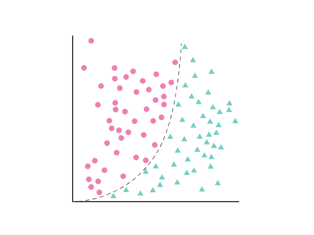
Gradient descent finds the weight (or weights w1, w2, w3, in the case of additional features) that minimizes the loss of the model. But the data points shown cannot be separated by a line. What can be done?
It’s possible to keep both the linear equation and allow nonlinearity by defining a new term, x2, that is simply x1 squared:
This synthetic feature, called a polynomial transform, is treated like any other feature. The previous linear formula becomes:
\[y = b + w_1x_1 + w_2x_2\]This can still be treated like a linear regression problem, and the weights determined through gradient descent, as usual, despite containing a hidden squared term, the polynomial transform.
Usually the numerical feature of interest is multiplied by itself, that is, raised to some power. Sometimes an ML practitioner can make an informed guess about the appropriate exponent. For example, many relationships in the physical world are related to squared terms, including acceleration due to gravity, the attenuation of light or sound over distance, and elastic potential energy.
Label Leakage
It’s important to prevent the model from getting the label as input during training, which is called label leakage.
Why?
If you include the label in your input features, the model cheats — it learns the answer directly rather than learning to predict it from the actual data.
Example
Imagine you’re training a model to predict house prices, and you accidentally include the actual sale price (price) as a feature:
features = ['location', 'size', 'price']  # 🚫 WRONG
target = 'price'
The model would just learn to copy the price column instead of learning how location and size affect price.
training a model to predict dog or cat
When training a model to predict something (like “dog or cat”), you must provide both:
- Inputs: the images themselves (the pixel data — e.g. arrays, tensors, etc.)
- Labels: the correct answer (e.g. “dog” or “cat”) — this is what the model tries to learn to predict
In this case, You do provide labels during training, but You do not include the label as part of the input features(like the image containing ‘dog’ letters).
Let’s say you have:
- Image 1: 🐶 (dog) → label: 0
- Image 2: 🐱 (cat) → label: 1
Training Code (simplified):
X = [image_1, image_2, ...]   # Input: pixel data only
y = [0, 1, ...]               # Target: labels (dog = 0, cat = 1)

model.fit(X, y)